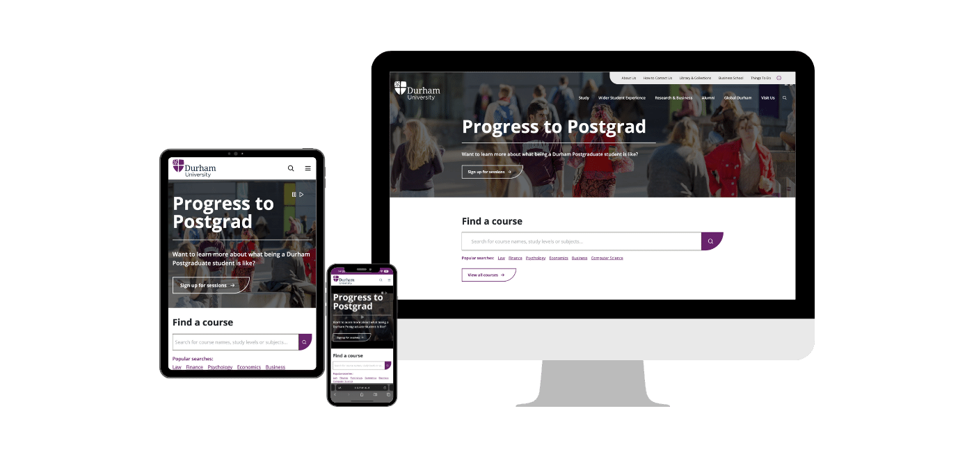
Transforming Durham University’s Online Presence: A Digital Success Story

About the Client

Durham University is the third oldest university in the UK, with around 20,000 students, a quarter of them postgraduates. They’re a Russell Group member with an international reputation in research and education.

But like all universities, Durham University competes to attract the best students in the UK and worldwide. That world is increasingly noisy as competing universities aggressively market themselves as the university to apply for by providing would-be students with all the information they, and sometimes their parents, need to know when making this big life choice. More so if that student is coming in from abroad, at some expense.

Business Challenge

Durham University’s websites, spread over fifty-five domains, were underperforming by presenting a picture that was hard to assemble in prospective students’ minds. Each domain was organised in slightly different ways according to that department’s or faculty’s mental model of what was relevant. 

Unlike many of their competitors, standard terms differed from site to site. Durham University already had a technical third-agency partner for their back-end build, tasking us with the rest. 


  • The brief could be boiled down to three points:
  • Reunify the website.
  • Make them more readily understandable.
  • Encourage student applications.

In Depth Student Research, Persona Development and User Journey Mapping

First things first, we reviewed the research Durham already had to see what we could build on or have to create from scratch. Durham University already had some personas, but we spotted that they didn’t describe different types of students in enough detail and generally needed extending and updating. To create our personas, we brought together data sources from various sources to help us build that picture. 

Namely:

  • A survey on the dur.ac.uk website.

  • A range of workshops and interviews with staff representing all persona segments.

  • One-to-one user interviews, including internal university staff.

  • “Guerrilla” style user interviews with existing students undertaken on-campus.

  • Data taken from Google Analytics.

  • Online research and statistics from sources such as HESA (The Higher Education Statistics Agency).

All of this initial research helped us build out and refine personas that were far more current for the wants of the university (Michael 40yrs external academic) and the needs of prospective students (Yu Yan, 24, prospective postgraduate student).

unnamed (3)-1Durham University | Enhancing The Digital Experience
A selection of some of the personas featured in a pack delivered to Durham as went through the discovery processes.

Using these broad personas, we also created journey maps to surface their students’ paths to and through the university. The personas gave everyone here at CTI and stakeholders at the university, clearly referenceable ‘people’ to use during discussions and development as a kind of shorthand. They fleshed out the very real concerns and issues that went through those students’ minds:

What may Yu Yan be thinking?
She wants her parents to be happy with my choice — “My parents are funding my study so they are quite invested in where I choose to apply to. My mother really wants me to live in the castle at Durham!”


The journey maps surfaced the known and, in some cases, the unknown paths prospective students took in researching, benchmarking and submitting an application on the website.

 Durham University | Enhancing The Digital Experience

Another pack was delivered, featuring some of the User Journeys discovered, based on our personas.

We gathered more student data and sense-checked what we’d done by providing opportunities for the students to give feedback, which is where we conducted some informal student interviews on campus and heard their experiences directly.

Durham University | Enhancing The Digital Experience

Here you can see Hanna and James fishing for passing students with free sweets encouraging them to share their stories and help us map their feedback. Surveys are quantitatively helpful; seeing and hearing actual students provides far more qualitative insights and empathy. It’s not all in the numbers but in the stories too — each providing the context and boundaries for the other.

Website Review and Competitor Benchmarking

We also took the opportunity to review and understand the existing website to see what worked and identify what didn’t —spanning the design and layout, website content, task completion, navigation and information architecture (IA) and the all-important site search. This was useful to reference when we benchmarked Durham to other universities we found to be their competition. Navigating with mobile devices was more challenging than mobile-first students would be used to — so that was a prominent issue we’d need to solve.

There’s no handier or cheaper form of research than a competitor review to see what works, what could work and what your competitors have got wrong — a natural source of mistakes to avoid and successes to be inspired by. It’s essential not to simply copy an average of the best ideas your rivals use but to use their inspirations that can apply to your website one or two stages further. In this respect, identifying and mapping competing websites’ strengths, weaknesses, and positioning was a source of valuable data for us as we benchmarked certain factors we discovered to be relevant to Durham’s audiences.

Untitled design-1Durham University | Enhancing The Digital Experience


Content Strategy

Whilst we were busy researching, in parallel, our content strategist colleagues reviewed the existing website content. They realised that the content was vastly inconsistent and wasn’t organised logically for student users. The web content was confusing prospective candidates at the very moment when they were trying to make sense of the university.

For universities, content is akin to their product. It’s the only way that a huge educational organisation can convey everything that they have to offer. We, and the DU team, agreed that we needed to adopt a content-first approach to Discovery, to lay the foundations for consistent content across a vast organisation. We laid out a strategic approach and the DU team brought together parties from the full breadth of the university. Our shared goal: to produce consistent, user-friendly content by:

  • Hosting multiple workshops, to understand how the existing content fitted together, the processes in place, and the brand that they sought to represent.

  • Defining a clear set of User Personas, to target all content work.

  • Collating our multitude of research to produce a concise Core Content Strategy, upon which to anchor all content.

  • Defining the Content Model - including all content types and their component parts, to lead TerminalFour in building a content-first site.

  • Producing a clear set of Digital Content Guidelines - explaining best practices for SEO and accessibility, as well as brand-specific content guidelines.


Creating an extensive set of Page Table templates - to encourage consistent content creation across the large organisation.

Upon presenting these new content strategy tools to the university, Steve Davison, the Senior Marketing Manager, said:
“I wonder how we ever got by without something like this before. Simple, concise, visually engaging, and a really good document to strengthen our partnership with the departments that we work with.”

Your website isn’t a filing cabinet in the sky.
There was another creeping problem; the Durham University website was being used to share internally focused content and documents to help university operations, which was of no use to prospective students at all.

These pages created a kind of information “chaff”, diverting and confusing prospective students. Those pages needed to be moved onto their intranet; that’s what their intranet is for, after all. We also found some duplication of content across the site — and that’s as confusing for students as it was for search engines. 

Analytics Audit — start your engines.
One of the cores of the new website was to promote student recruitment; it was essential that search engines could efficiently find the latest content so that students could discover the university and its courses. This is where our colleagues in our Digital Marketing team assisted us in understanding the existing issues and planning for the new website search engine ‘friendliness’ whilst maintaining and redirecting the existing traffic. Speaking of which, it turned out that the existing traffic was spread over fifty-five domains — so there was much consolidation to do. 

Stakeholder Management
Creating change in any organisation, whether you are a multinational business or a university, can become political and, if not handled properly, a heated affair. Each owner of the fifty-five domains had produced content from their department or faculty’s point-of-view. 

They had to understand the wider ‘why’ of this new format and hierarchy and see how it ‘raised the tide for all ships’ generally and supported their goals.

We’d planned a drop-in room to give us a chance to talk to any of the stakeholders and personally explain our research results and processes when the pandemic hit. Throughout the process, we produced and presented the results and findings of our research as distinct packages so that, over time, all of the stakeholders could see the components parts we were working with.

Digital Vision, Design and Prototype

Having established what the universities goals were and creating personas for stakeholders and the students themselves, we’d prepared ourselves for the next stage of the project; to vision, design and prototype some potential solutions.

Process of designing, prototyping and validating

We’d built up our ideas and hypotheses as each research part was delivered. Sketches were doodled, and low-fi wireframes shared amongst our covid-sheltering team. We learnt, along the way, how to work remotely but together. Even low-fi doodles could be remotely tested with video call one-to-ones with students. 

As we went along, we worked up wireframes for mobile devices to build in an equal quality of experience; mobile was where most students would start their research, after all. 


Brand

Durham’s branding had been updated a few years previously and applied to their existing website, but we thought there was an opportunity to implement those guidelines in a far more modern and vibrant way that was more likely to appeal to students. Durham has a long and established history, but that didn’t mean it couldn’t look modern by using combinations of more saturated colours, within the guidelines, and making further use of the graphic ‘tapestry’ devices.


Design systems

We expressed our new reinvigorated visual approach in our design system for Durham’s website. Producing static designs for every page of the website wasn’t an efficient use of budget. Design systems can provide more flexibility for clients and ourselves by building a system of interchangeable components that can be combined and recombined to create the web pages you want — and the pages you don’t yet know you need. Like Lego bricks, if you have suitable shapes available, you can build anything you can imagine.

For us, especially at this stage, having a flexible design system allowed us to reconfigure and hone our designs whilst sustaining consistency and creating a universal visual and experience language. We weren’t distracted by having to design new components continuously but reuse components where applicable, only building new pieces for the design system overall — making the design system more robust and adaptable as we went.


Prototyping — making it real

From the outset, we created low-fidelity prototypes to test our hypotheses with users and groups. With many of the research parts coming together, it was time to produce a high-fidelity prototype. This would be the clearest example yet for users and stakeholders of what it looked like and how it might work.

Again, we used Figma, although we may have pushed its capabilities a little too hard at the time. You can see the prototype here, assuming you have a fast computer and broadband connection. 


Durham University | Enhancing The Digital Experience

This prototype demonstrated and assured stakeholders, some of whom may not have been able to visualise the end piece, exactly where the website was going. It also provided the last chance for feedback before beginning the more complex task of creating an HTML, CSS and Javascript working prototype. 

In-house UX Testing in CTI Digital's Ultra Modern UX Lab

We have the convenience of our own usability lab in our main office in Manchester, which is where most of our UX team is based. As you’ll have realised, we prefer to know if our work works rather than hoping it does, so testing is essential. There are lots of types of testing we do, but undoubtedly the user lab provides us with the strongest feedback loop of all.

The lab itself is dressed to look like an inner city flat living room, but a living room with a one-way mirror, video surveillance and eye tracking. Recruited students were given a series of tasks and we observed them on desktop and mobile phones. We could compare what users were being asked to do, against what they were saying and what they were actually doing.

The Durham high-fidelity prototypes provided us with a chance to double-check that real users, unburdened with our biases and preconceptions, could complete a series of tasks we’d devised in our testing plan.

Durham University | Enhancing The Digital Experience

Quality Assurance (QA) Testing - for all projects

All of our projects undergo rigorous testing throughout the web development process. In order to deliver the utmost quality for clients and their respective users, our in-house QA team ensures that all end products perform accurately and reliably under normal and abnormal conditions. Testing is followed by continual monitoring of software performance, to prevent reoccurrence of any issues and to ensure efficient ongoing operation.

As such, we were able to confidently deliver a well-designed, scalable and technically stable result.

Results

After a year of design and development, the new website was ready to hold the new content, strategised and optimised. But this wasn’t going to be a big bang launch; this was the start of the migration of some content from those fifty-five domains — one college and department at a time. Over a year, each piece slowly came into the fold, and Durham University’s website changed from the bottom upwards. 

We worked hard to discover who the university users were and what journeys they needed to take to meet their needs, and we worked with the university to understand their desired outcomes. We took fifty-five domains, each of them the vital university pieces of a jigsaw that was hard to make sense of from an outside perspective, and brought them harmoniously together. 

We’ve made Durham University’s website greater than the sum of its parts — and far more accessible for students and academics to understand. 

FOUR TAKEAWAYS

— Research is quicker.

Durham University’s website’s success is built on the depth and quality of the foundational research into their users and the paths they have to take. Yes, you may have some personas and ‘know’ who your customers or students are as a by-product of working ‘with’ them, but your website will be built on informed guesses without in-depth research. Knowing is always better and far cheaper in the end.


—  Prototypes are useful, but it’s the code that counts. 

Although we were selected for our research and UX skills, we used our development skills to build the HTML/CSS front-end too. This empowered us to go beyond wireframes and prototypes to produce the website in the only medium that counts for users — in their browsers and on their phones. Far less is lost in translation.


— Crafting the fit

Splitting up your project amongst suppliers is a risk if those suppliers aren’t aligned to work together meaningfully, but as CTI Digital and Terminalfour have shown, it can be successfully done. Knowing how to code around and within the constraints of the CMS platform makes the overlapping easier.


— Bring stakeholders along

Sharing the research with stakeholders was essential so that all departments and faculties scattered across the fifty-five domains could see the ‘whys’ behind our decisions. It allowed everyone to digest feedback and be heard within the shared context of the website’s primary roles.

The University has taken a massive leap forward in its web platform and design; it’s moved towards a more modern system, modern design, and information architecture — the lot. It’s been a massive change. I was quite shocked that we managed to deliver this massive change project.

Steve Davison, Senior Marketing Manager, Durham University