5 considerations for designing a university website

A university’s website should not only aid visitors in finding a course but also guide them through the unknown, giving prospective students all the information they need to make one of life's biggest decisions.
University websites are complex beasts. Let's break it down: Take stressed users and introduce them to an unfamiliar process with vast amounts of jargon-filled information. Throw in an abundance of choice, application deadlines, accommodation considerations, and the added uncertainty of impending exam results. Sound like a recipe for disaster? It doesn't have to be...
Here at CTI, we’ve worked on our fair share of university websites. We have extensively researched prospective students’ behaviour, identifying their thoughts, goals, and frustrations at various stages of their further education journey.
These findings have informed not only our user experience (UX) design but also fed into our visual design and content strategy work for educational institutions.
We thought we’d share five key findings from our research. This may be just the tip of the iceberg, but should form a good starting point as you embark on your own journey researching what makes the perfect university website.
1. The Search is On: Boost SEO and Onsite Search
When trying to find potential universities, prospective students will often begin with a Google search. Topic-specific search engine optimisation (SEO), local SEO, content strategy, and paid search marketing all play an important part in ensuring your site is suggested in response to relevant queries.
The built-in website search is equally important. The search must be easy to navigate, and it should return clear and easily filterable results. First impressions are crucial, so providing a frictionless experience reduces the risk of the user missing the result and leaving the website. Able to access the necessary information, prospective students will be able to consider study at the university.
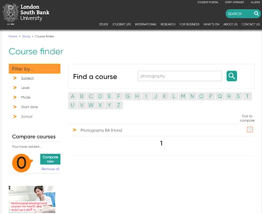
London South Bank University offers a powerful search for users, allowing them to filter results by subject, level, mode of study, start date and school. They also give users to ability to select multiple courses and compare them side by side.
2. Prospective Students Give up Easily: Make Answers Accessible
Most prospective students are young people: digital natives who have grown up using the internet. This means that they are very confident in their ability to find information online. However, our research suggests that it also means they’re more likely to give up if this information is not where they expect it to be. Therefore, it is important to prioritise clarity and ease of access to information, ensuring that prospective students are engaged and less likely to exit the site before learning the information they need.
"Digital Natives require information to be readily available, if it isn't they'll quickly give up"
3. University is Expensive: Provide Trustworthy Facts and Figures
Let’s address the elephant in the room: studying at university is expensive.
You know it, prospective students know it, so why try to hide it? On the course information pages make the price big, bold, and impossible to miss.
Oh, and don’t just show the basic cost of studying. Detail any additional costs that may be associated with the course too. Nobody likes nasty surprises, so clear, upfront information is key here.
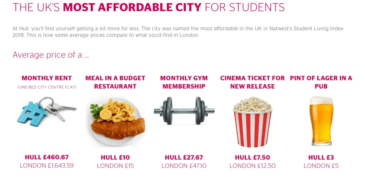
Hull University not only highlights the cost of study on their course pages, The website also contains content that clearly demonstrates the cost of living in the city.
4. Modules are Important: Give Detailed Course Information
Right, so students know they are paying a substantial amount for their studies, but what are they actually going to learn and how does that align with their career aspirations?
The actual course content is not always communicated by the course title, and most subjects are usually offered by multiple institutions. The specific course content is the space where universities should give as much detailed information as possible: show why the course is unique, and why it's the best fit for individual students.
No matter how busy their social life, the majority of a student’s time is going to be spent immersed in their modules. A student's interest in their course content directly impacts both their academic performance and their expected happiness during their time at university.
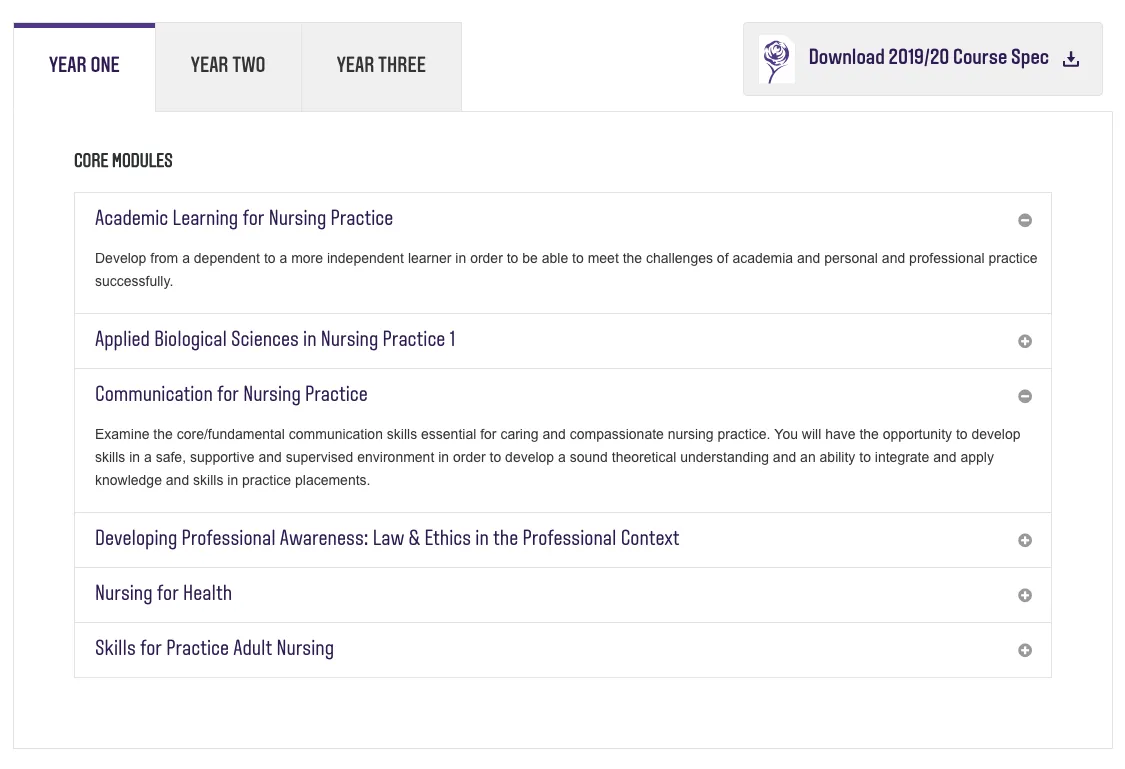
Leeds Beckett University provides prospective students with a very clear and easy to digest overview of exactly what they will be studying.
5. Don’t Act Cool: Adopt a Formal Tone
Yo, if you're thinking about making your website super-hip to be down with “the kids” - don’t. Not only will young people see right through the act, but an informal tone gives the impression to prospective students (and their parents) that you’re not taking this as seriously as you should. Your reader wants to find a formal, authoritative voice that they can trust to give them the relevant and accurate information they need to make an important decision. So take it easy with the memes.
At CTI Digital, we build award-winning websites. Our experience has lead us to work with some of the UK's top universities, Charities, and Public Sector organisations. Think we can help your Higher Education organisation? Get in touch.

CTI Digital's team of digital marketing and technology experts specialise in digital strategy, web development, and growth marketing. We help ambitious brands navigate the digital landscape with proven strategies and cutting-edge technical expertise.