7 ways to increase donations on your charity website
Making a donation is an emotional decision. A rise in charity fraud has lead to patrons demanding increased transparency. In particular on where their money is going and what challenges a charity is fighting against. Increase donations by ensuring that your website, most importantly your donation page, clearly states your core message - in plain, simple language.
To encourage donations, focus on answering potential-donors’ top questions and streamlining the donation process. Our design and UX experts have created this guide to best practices for charity websites. Learn how to optimise your donation page and improve your fundraising strategy.
Step 1) Make donating obvious and easy to find
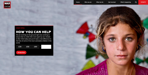
As a charity, you may have monthly or yearly fundraising goals that you wish to meet. If this is the case, asking for donations up front will be key for meeting these goals. Focus your website on encouraging quick and easy donations, with a clear, user-friendly journey (as demonstrated on the War Child website).
Step 2) Simplify the Conversion Funnel
Visitors don’t want to spend vast amounts of time filling out lengthy forms to make a donation. They just want to make it. Keep the conversion funnel short and simple by only collecting information that is critical. Also, don’t over complicate the process by asking users to create an account.
Donate (in multiple denominations) > Name, email contact number > Enter payment details > Thanks for donating page
Further ways you can simplify the conversion funnel to make it easy for people to donate are:
-
Make the ‘donate’ button recognisable: The ‘donate’ button should stand out from the rest of the page so visitors can click it easily.
-
Signpost your forms: If you need to collect information from a user, show all of the steps up front. This could be represented visually as the user moves through the form. Add a progress bar, or a marker counting down ‘1/5 pages’. This way people know what they are in for and there are no fears of endless form paranoia.
Use third party payment integrations: The security of your donors personal information should be paramount. Use third party payment integrations, like Paypal or SagePay, to reassure your users that your site is secure. Security badges are a familiar and encouraging sign for new donors.
Step 3) Reduce common online friction points
Once people have made the decision to donate, make it easy for them to complete the transaction. A simple user journey will improve conversion rate and minimise the risk of form abandonment.
To ensure your donor’s have a frictionless user experience when carrying out the donation process, optimise the following areas:
-
Site Speed: A 10-second delay when loading will often make users leave a site immediately before they decide to donate. Optimise the size of your images and videos so they load quicker when a user lands on your site. You can also install a CDN to reduce the resources required to run your website and improve its speed.
-
Accessibility: If a user can’t read your copy or navigate around your site, then potential donors may be put off. It’s not as difficult as you might think to get started with improving accessibility on your website. Check out The A11y Project or contact us to discuss an accessibility audit by our experts.
-
Call to Action: The best donate buttons are consistently present on every page. Make it easy to donate by offering multiple donation amounts (£5/£10/£25) and the ability to donate monthly. Incentivise giving with an explanation of donor benefits, such as quarterly updates, certificates or branded items.
Step 4) Display tangible benefits from your organisation to encourage donations and build trust
Before giving their money or time, donors want to understand the charity’s cause and who will benefit from the donation. Make the site visually impactful by including engaging imagery and video content to truly show the cause you are fighting for.
Also, put donations into context by using real people and real examples to make your work and messaging more authentic. Visitors will then be able to see exactly what a difference their money is making. For example, WaterAid state that a £15 donation can buy 1.5 metres of pipe to deliver clean water to tap stands.
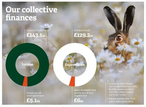
Be transparent about where an individual's money is going to, such as in the Wildlife Trusts example below. Reassure donors that their donations will go towards the cause, not just the operational costs of a large charity organisation.
Step 5) Ensure your site is mobile responsive
Design for mobile first and you’ll attract a much larger audience. Google’s mobile-first update saw search engines give preference to websites that are tailored to mobile site visitors. Research shows that 62% of consumers are less likely to purchase after a negative mobile experience.
There are a number of ways you can ensure your website accepts donations on mobile devices, including:
-
Optimising forms,
-
Serving tailored content specific to mobile visitors
-
Offering a seamless experience when viewing website content on mobile devices
Read how we improved The Royal College of Occupational Therapists website to be mobile first.
Step 6) Personalise the donor experience
After collecting donations and capturing contact information, send personalised follow-up emails to your donors. Show them where the money went and thank them for their support. Use personalisation tokens to feature their name, donation type, or even something relevant to their local areas. All engagement from your audience should be viewed as an opportunity to work together now - and in the future.
Informing people of the impact of their donations allows them to feel as though they are making a real difference. Knowledge of a charity’s impact often leads to long-term donor engagement and a real sense of connection to the cause. When a charity keeps in contact with donors personally, those individuals may extend their one-time donation into more regular giving. Over time, this could then lead high-level fundraising for your cause. Keeping patrons engaged with your cause is crucial for the success of your fundraising.
Once individuals have had an opportunity to donate, suggest secondary engagement methods to turn them into advocates. Continue their engagement by encouraging activities like volunteering, signing a petition, subscribing to a newsletter or taking part in fundraising events.
Step 7) Track, measure, adapt and improve changes
Data is key to measure the success and performance of your website. Use data to focus on what works best to drive people to your site, complete conversions and drive future interaction. Conversion data should direct what changes you make. Track user behaviour to evaluate what is working and what isn’t, then to gauge the impact of your changes
Use tools like Google Analytics and Hotjar to dig deep into your users’ behaviour. These insights will help to identify areas for optimisation. Carry out A/B testing to see which features get your users to convert the most.
However, improving your conversion rates is an ongoing task with no completion goal. Make small, continual improvements to your site’s messaging, content and design, with the aim of maximising conversion to donate.
Talk to us today for a professional CRO review of your charity’s website. Our experts can help you improve your online fundraising strategy.

CTI Digital's team of digital marketing and technology experts specialise in digital strategy, web development, and growth marketing. We help ambitious brands navigate the digital landscape with proven strategies and cutting-edge technical expertise.