User experience (UX) is best described as:
The process of enhancing customer satisfaction and loyalty by improving the usability, ease of use and pleasure provided in the interaction between the customer and the product.
Agility IM
‘Good’ UX will allow your customers to navigate easily through your online store or website, add products to their basket and proceed to checkout to purchase products or make a donation without friction. Optimising your UX in this way will improve your bottom line or your donation numbers, as you take away common online shopping frustrations.
What are the benefits of optimised UX?
1. Utility: Help online users find what they are looking for
By grouping products in a logical fashion in the navigation, it helps the user to choose and ultimately buy the products and services they want or need. Refined UX makes products and donation amounts easier to find for the user, reducing the amount of time wasted looking at irrelevant items.
2. Usability: Make it stress-free to get around your site
The customer journey should be clear and easy, without unnecessary clicks, slow loading times, overloaded copy or inconvenient navigation. If a site does have these features, it can lead to a frustrating experience for the end user because the usability of the site isn’t intuitive.
3. Desirability: Positive experiences lead to returning customers
The website should have the right look and feel, in line with the company or charity’s branding, to make the user experience easy and enjoyable. If users have a positive experience navigating and browsing your site, they are more likely to return to it in the future.
4. Accessibility: Make sure you're optimised for all
The design and layout should be presented in a way that can be accessed by all users, whether that is someone with a disability or with differing levels of technical literacy. Also, with the ever-increasing reliance on mobile devices, it is vital to design any new site or web presence with mobile user experience at the forefront.
Now that you've grasped the foundations of UX, you can apply them to your entire site. Prioritise your improvements by starting with global elements seen across the site.
The importance of ‘global elements’
What are global elements?
Global elements are features that are present widely on the site. They make up the basis of the visual hierarchy and are instantly recognisable as they are usually the core zones of interaction. Examples of these would be a header or footer.
Designed how users would expect
Some global elements have become de facto standard within UX, particularly the structure and layout of an eCommerce store. When coming from other websites, users will sometimes have expectations about where certain features will be, especially from a visual perspective. Your site's appearance should not try to reinvent the wheel, but rather reduce friction for your customers.
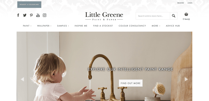
One such feature is the navigation. Users expect the navigation to be consistent no matter where they are on the site. If the navigation changes depending on the page they are on, this can cause confusion. Examples of how this may go wrong include offering different links at different points in the journey or changing the location or shape of the navigation entirely.

Little Greene Paint Company using a consistent navigation
The main navigation menu should also be organised clearly to allow for easy browsing. Two types of people will generally come to an online store: those who just want to browse and those who know what they’re searching for. For both types of users, this navigation needs to be displayed clearly and be accessible to prevent frustration at not being able to find products.
Pioneering footwear brand inov-8 using optimised mobile navigation elements.
A final note on removing friction to purchase...
Feeling unsafe or a lack of trust in the website is a major cause of basket abandonment. An indication that the site is secure will give your customers a reason to believe their payment is valid and they will receive their products. This can be achieved through an SSL certificate, the use of a simple banner which includes business contact details, badges from trusted sources - such as Feefo, TrustPilot or Google - or payment logos, like Visa or PayPal.
This is just the foundation of UX. There's plenty more to implement, experiment with, and research. Get in touch with our expert team to discover how you can increase your conversions.
Read our Conversion Rate Optimisation Blog for specific ideas on what you could implement to increase conversions on your online store.


.jpg)


