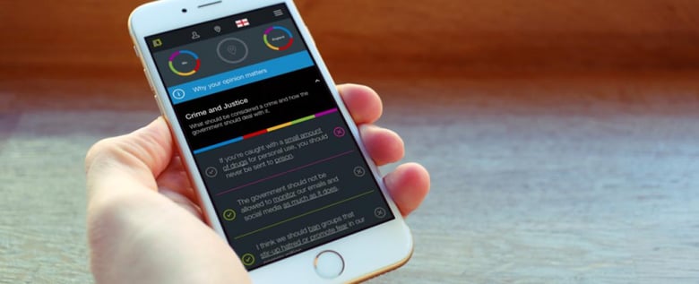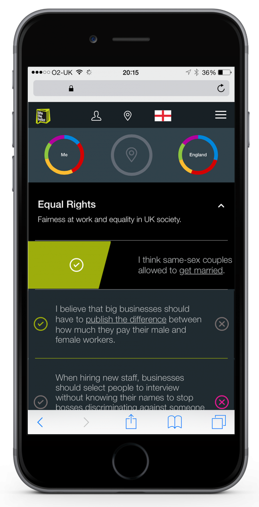
Recently, our Mobile and App team was involved in building Verto, a HTML5 application that helps to engage 18-24 year olds with politics. Comprised of 3 dials and 33 statements over 13 topics areas, users are able to see in real-time how their views align with the major political parties.
Before we launched, we added event tracking to the application, so we could identify any trends with the way users interacted with it.
Swipe to agree, tap to disagree

We found that users were swiping to agree with statements, but preferred tapping to disagree with a statement. But why?
We found that the "burger menu", located on the right side of the application and a common interaction, swiping to the left to open, was interfering with the swipe gesture to disagree with a statement.

This meant users were becoming frustrated and instead chose to tap on the disagree button rather than mark the same decision with a gesture.
Learn fast, improve faster
What seems more like a "d'oh, why didn't we think of that sooner" moment is a testimony to the importance of learning from your users and improving the way they interact with your application.
We fixed the problem really simply, by disabling the menu swipe when a topic area was open, thus allowing user's to comfortably swipe left to disagree to a statement.
We've since seen a 25% increase in swiping to disagree with a statement vs tapping.
Lesson learnt. Problem solved.
Now, why not head to our project page and find out more about Verto?


